
At Myerton Packaging, colour management is integral to our custom packaging solutions. We prioritize accurate colour reproduction to maintain brand consistency, enhance product appeal, and meet client expectations. Here’s a guide on colour management and how it affects your brand’s custom packaging.
What is Colour Management & Why Colours Differ in Print
Colour management is the process of ensuring consistent and accurate colour reproduction across different devices, such as monitors, printers, and scanners. It involves the use of various tools, techniques, and standards to control and adjust colours to achieve desired results.
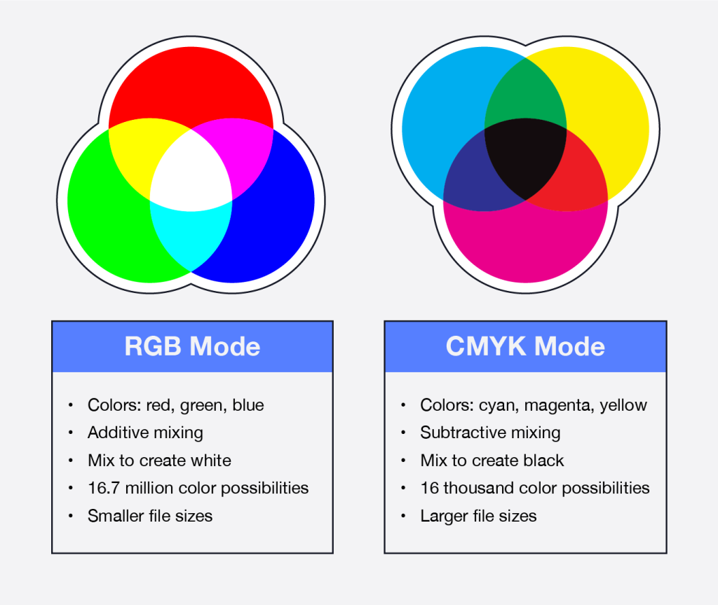
RGB is used for digital design and screen-based presentations of packaging designs, CMYK is the standard color model for printing packaging materials. Designers need to be mindful of color conversion and color accuracy when transitioning from RGB to CMYK for final packaging production to ensure that the intended colors are faithfully reproduced in print.
What is Pantone for Custom Packaging?
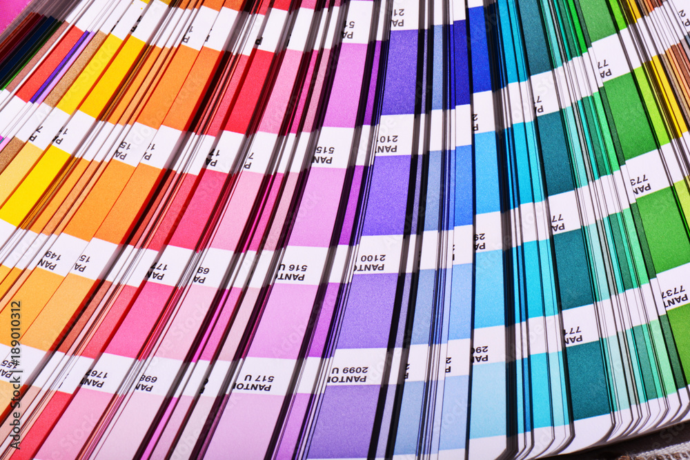
Pantone is a globally recognized colour-matching system used in various industries, including graphic design, printing, and custom packaging. This integration of Pantone colour management enables Myerton Packaging to meet client expectations, enhance product appeal, and maintain regulatory compliance where necessary.
G7 Solutions for Colour Management
Myerton’s printing partners are G-qualified facilities so you can be assured of a packaging close to your vibrant brand colours. It is a solution for colour management, defining grayscale appearance and providing a calibration method for adjusting CMYK imaging devices.
Myerton Packaging’s Colour Management Expertise
We understand the critical role that accurate and consistent colours play in reinforcing brand identity, enhancing consumer perception, and ensuring regulatory compliance that’s why Pantone colors serve as a benchmark for color accuracy. By referencing Pantone colors in your design and providing Pantone swatch references to your printer, you establish a standardized color benchmark for your printed materials.
We work with your design team or agencies for file preparation. We provide professional suggestions during the design stage. During pre-press stage, we check whether our Clients have any colour-match requirements. A colour difference check was conducted on several samples, focusing on the background colour. By checking your samples with ours, we can determine how high or low the match is compared to print runs, materials, and machines used.
During bulk order production, we conduct eye-examine and closely match bulk order with our sample or Pantone swatch book. In addition, we utilise, X-rite spectrophotometer to add an extra layer of accuracy.
For Australia-based productions, we can only offer a digitally printed sheet.
Click here to learn more about Myerton’s order and production timeline.